We offer several predefined color palettes within our Satellite imagery API. This tool is designed for developers of agricultural services or applications.
What does NDVI mean?
NDVI (normalised difference vegetation index) is an indicator of plant health. It is calculated based on visible and near-infrared light reflected by vegetation. Healthy and unhealthy vegetation reflect and absorb these light spectres differently.
NDVI is calculated using the following formula:
NDVI = (NIR - VIS) / (NIR + VIS)
Resulted number will range from -1 to +1. Zero and values below zero mean that no vegetation is present. Values close to +1 (0.8 - 0.9) indicate the highest possible density of healthy green leaves.
To assess the health of plants on the surface of the Earth, you can use the numerical values of NDVI. By using different colour palettes, you can also visualise it on the map.For many users, visual assessment is much more convenient and visually descriptive.
Custom palettes
For developers of agricultural services or applications, we offer several predefined color palettes.
1. Standard "green" palette. This is a classic palette ranging from white (no vegetation) to dark green (thick, healthy vegetation).
2 Black and white palettes.The black-and-white palette is built on the same principle as the green and contrasting ones. The only difference is that black-and-white gradient is being used for colouring.
This palette is intended for developers who can independently colour it by following any principles convenient for them personally. Having processed the black-and-white image in one way or another, for example by using Javascript code, one can make an image of 256 colours (or even with three colours, for example, green, red and white).
This option allows you to use your palette that was customised according to the client needs.
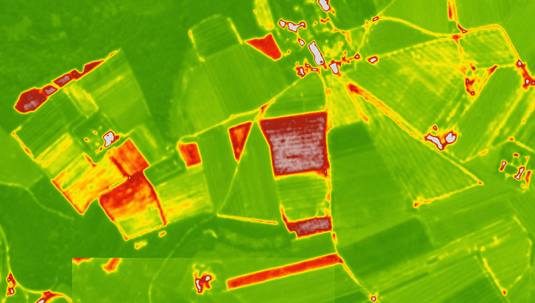
3. Contrasting palette.
When using contrasting palette, smaller values with low vegetation are displayed in red, whereas high values are coloured as different shades of green.
The contrasting palette has certain advantages over the green, especially for agronomists. On the contrasting palette, the values of NDVI important for specific situations and cultures are brighter. In cases when the index fluctuates within one field, its heterogeneity is displayed with more contrast. For example, very rare or dried grass can be seen better on the contrasting palette (as a bright red spot). If the field is uniformly green - this means that the vegetation there is more or less homogeneous.
Of course, considering the homogeneity or heterogeneity of the field based only on one vegetation index is not always reasonable. It is necessary to take into consideration, for example, the features of the relief, which can also affect uniformity. However, for a baseline assessment, an NDVI image is sufficient, especially when it comes to flat fields. To assess the state of vegetation in areas with more complex topography, you can superimpose an NDVI image on a relief map.
How to get NDVI values?
We provide NDVI within our satellite API for the selected polygon in several formats. Product description and instruction on how to work with it can be found in our blog. Please get familiar with the relevant documentation and articles in “Satellite imagery API”.
By using API calls, you can get:
- an image of a polygon in PNG format- a tile in PNG format- zonal statistics for NDVI & EVI indices of a polygon- an image in GeoTIFF format.
To select a palette, you need to use the palettid parameter when calling an API
1. Green palette, the common NDVI palette - paletteid=1 (default)Control points: (0, 0.1, 0.2, 0.3, 0.4, 0.5, 0.6, 0.7, 1)
Example of response:
2. Technical palette, black & white, to set your colours - paletteid=2Control points: (0, 1)
Example of response:
3. Contrasting palettes:
We offer 2 options for contrasting palettes.
Contrast palette #1 - paletteid=3Control points: (0, 0.25, 0.3, 0.35, 0.4, 0.45, 0.5, 0.55, 0.6, 0.65, 0.7, 0.75, 0.8, 0.85, 0.9, 0.95, 1)
Example of response:
Contrast palette #2 - paletteid=4Control points: (0, 0.07, 0.15, 0.23, 0.3, 0.37, 0.45, 0.51, 0.58, 0.65, 0.7, 0.75, 0.8, 0.85, 0.9, 0.95, 1)
Example of response: